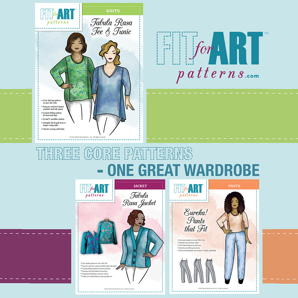
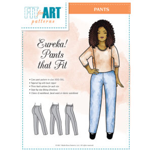
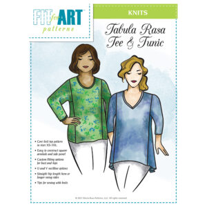
We hope you have heard (and seen) the big news by now! As part of our celebration of Fit for Art’s 10th Anniversary, we are redesigning our pattern covers, starting with the three core patterns. We hope you followed along on our week-long reveal and love the new look as much as we do.
We had several goals in mind when presenting this project to our new graphic artist, which made it quite a challenge. So first we want to extend our deeply felt thanks to our design partner, Alison Cooper Design, and to our website and media guru, Amanda Wozniak, for all of their help.
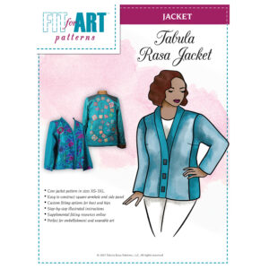
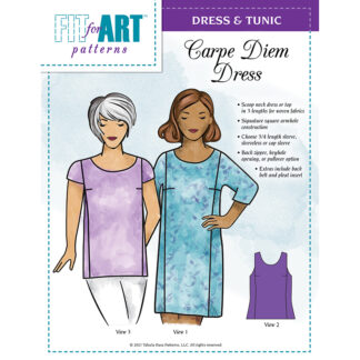
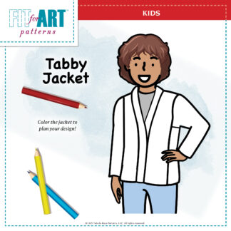
The redesign was prompted by our desire for a fresh look with more realistic garments on a human body. At the same time, we did not want to use photographs of the garments on models as we felt that could limit sewers creative imaginings for the patterns. In addition, we wanted more inclusive models who represent the wide variety of gals who are sewing successfully with our patterns. This wish list led to our decision to feature sketched models wearing basic examples of the garment which accurately represent the pattern lines. The Photo Gallery on our website and social media posts on Facebook and Instagram still provide plenty of photos to help you picture the finished garments and inspire your creativity!
For a long time, we have also wanted to be eco-conscious by eliminating our plastic bag packaging. These fabulous new covers are being printed on large paper envelopes to hold the tissue patterns and instruction booklets together. The Variations and Details covers will follow in our new look and paper envelopes soon, after we finish another project that’s keeping our graphic artist busy. We hope you will join us in being kinder to the environment by re-using those old plastic bags as long as possible!
Finally, we wanted to make our color-coded core pattern and variation system more obvious while creating more consistency across the pattern lines. Once our variation and detail patterns are updated, it will be easier to see that all the raspberry patterns and variations are for the Tabula Rasa Jacket, the orange patterns and variations are for Eureka! Pants that Fit, and the lime green patterns are for the Tabula Rasa Knit Tee & Tunic and its variations designed specifically for knit fabrics. You might not even have noticed, but we also flipped the use of color in our logo so that the big type will be the same teal blue across all of the pattern lines, with the secondary color appearing in a minor role.
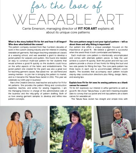
The image used for the puzzle reveal of the new covers last week comes from our full page ad in the latest issue of the digital magazine ThePatternPages.com. We were very honored when the editors invited Fit for Art to be featured in the “10 Minutes with…” interview in issue 22. This digital magazine is produced in the UK and is targeted to the international sewing audience. Now that many of our patterns are available as digital downloads, we hope to reach more sewists around the globe. We hope you will take a few minutes to check out the digital magazine at thepatternpages.com, join their newsletter mailing list, follow @thepatternpagesmagazine on Instagram, and subscribe so you can enjoy our interview! Look for one of our rain jackets and the Tabula Rasa Jacket pattern included in the review of Lightweight Jacket patterns.
How do you like Fit for Art’s new look? We’d love to hear from you!
Happy Sewing, Carrie



Thumbs up on the new covers, I really like them.
I love the new pattern covers – they look great. Happy 10th Anniversary!
Followed you for years! Congrats on your success. Appreciate how you have met the challenges of COVID and continued to keep your business flourishing. Thanks, too, for being eco-friendly!
Thanks so much for your encouragement!